Logo Design
The Nesting House
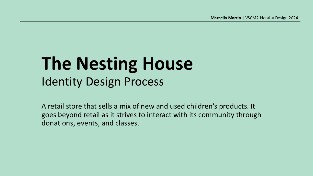
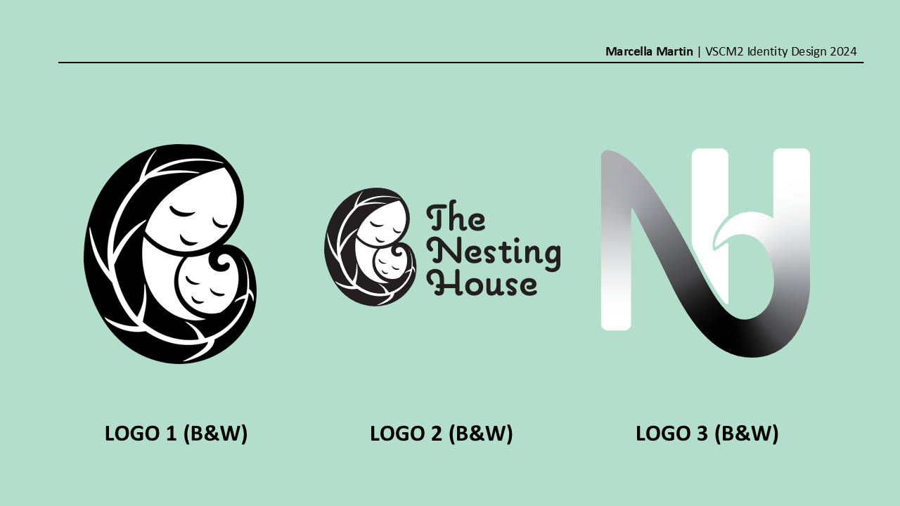
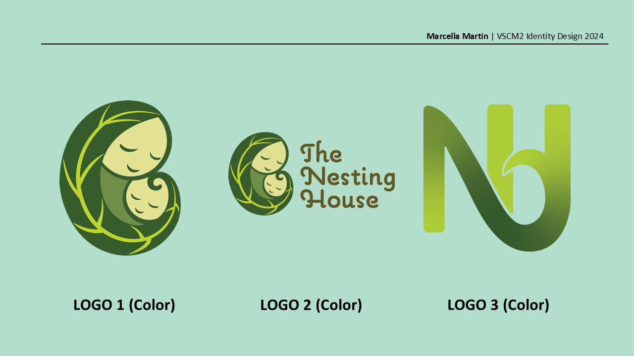
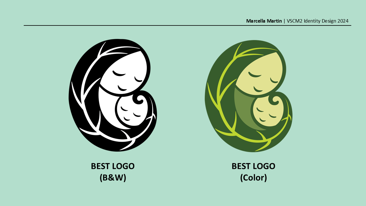


Case Study
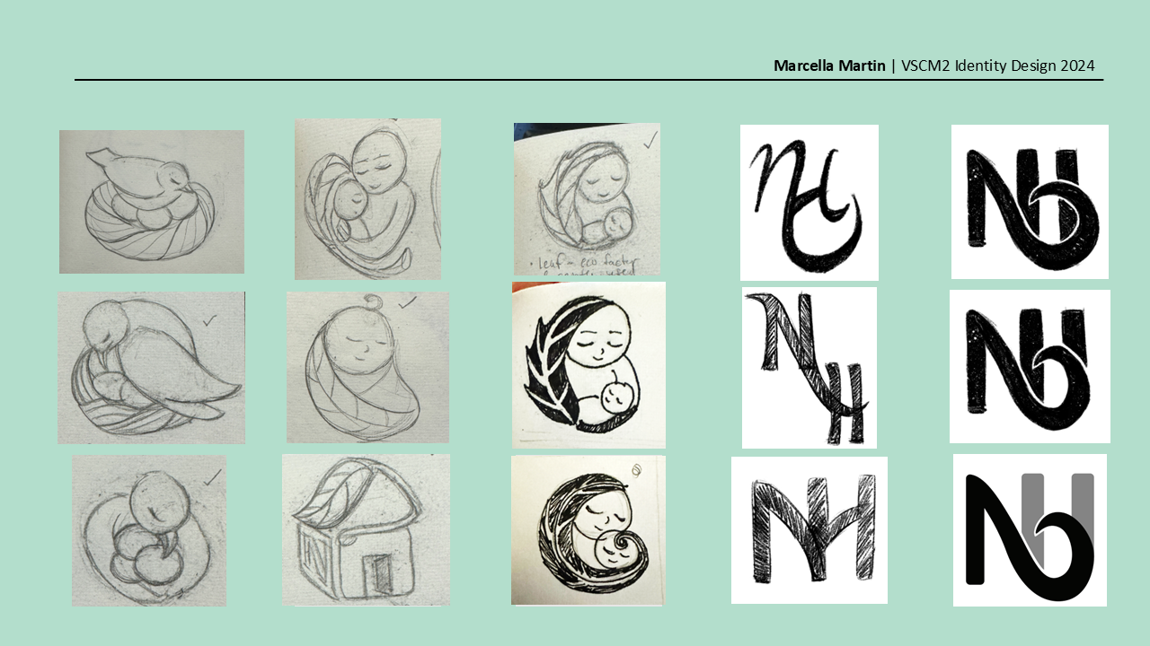
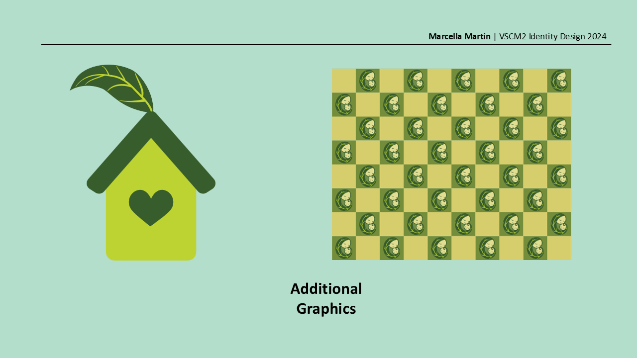
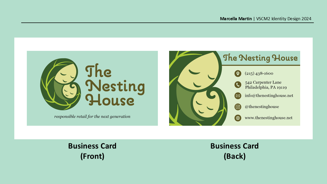
This logo was developed through explorations of nature, nurture, and connection. While the original logo felt too complex, I wanted to capture its essence in a simpler, more cohesive form. The leaf reflects the brand’s connection to nature and sustainability, while its enclosing shape forms a home that symbolizes care, comfort, and the bond between parent and child.
If you would like to see the design process, please view the slideshow.
Projects


Typography